The temperature data supplied by the Bureau of Meteorology is relied on by many climate agencies to support claims of climate change. Some of this data however has been modified. If BOM has been getting it wrong, how can we trust that they are now getting it right? I asked them last night at Senate Estimates.
Transcript
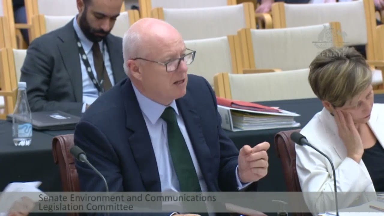
[Senator Roberts] I draw your attention to your State of the Climate reports, 2016 and 2018, and specifically the two graphs of Australian surface air temperatures. One in State of the Climate 2016 on page four and the other in State of the Climate 2018 on page two. Are you familiar with those reports?
[Dr. Johnson] I’m familiar with the reports, but I confess, you know, I haven’t committed those pages to memory.
[Senator Roberts] I can understand that.
[Dr. Johnson] No, I am familiar with the reports, yeah.
[Senator Roberts] One of our research scientists, in updating his records, compared your 2016 graph on page four and your 2018 graph on page two. He then obtained from the Bureau of Meteorology the actual temperatures used in producing those two graphs. He found the two graphs very different for the dates from 1910 to 2016 yet surely the temperature data from 1910 to 2016 should be the same for both graphs, shouldn’t they?
[Dr. Johnson] I believe so, but again, I’d need to check exactly what you’re referring to ’cause they may, Dr. Stone has the report, I think, in front of him. Are you able to shed any light on this?
[Dr. Stone] I’ve got the more recent one. I’m sorry. And like Dr. Johnson, I haven’t committed.
[Dr. Johnson] I’m happy to take these-
[Dr. Stone] It might be easier just to- So we’re comparing apples with apples, Senator, and happy to answer your question.
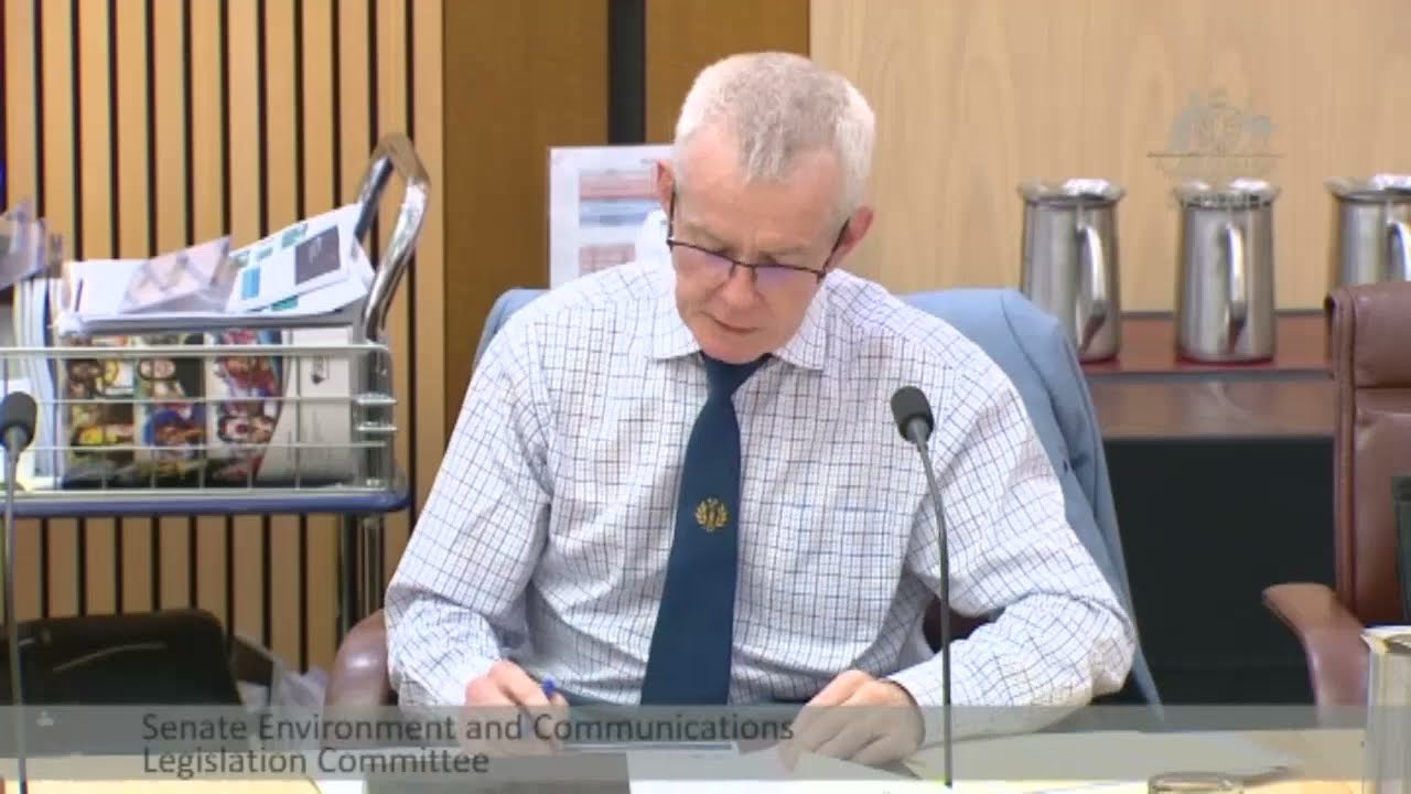
[Senator Roberts] So let me get to the core point, then. The only changes to produce the 2018 graph should have been, as we see it, the addition of data from 2017 to 2018 on top of the 2016 graph, yet the actual data shows that in the 2018 graph, temperatures after about 1970, looking at the graph, from your perspective, are inflated and progressively increased. And the temperatures before 1970 have been progressively decreased with the effect of increasing the slope of the temperature graph, exaggerating the warming. So I’d like to know what is the reason, on notice, what is the reason for this when temperatures of historical records end up records up to and including 2016 should not have changed at all, let alone systematically changed one way after 1970 and the other way before 1970 to exaggerate the warming. I’d like to know that answer.
[Dr. Johnson] I think we’re happy to take that on notice to make sure we’re answering your question accurately, Senator.
[Senator Roberts] On notice, what basis, on what basis were the temperature data from 1910 to 2016 changed to produce the 2018 graph for the years 1910 to 2016. And has the Bureau of Meteorology’s Australian temperature record been wrong every year until 2018? Can you guarantee that the 2018 record would not turn out to be wrong in 2024? Or is the Australian temperature record anything that BOM says it is? That’s what I need to answer.
[Dr. Johnson] Take those questions on notice, chair, if that’s alright.








OK. I get that weather and climate are two completely different animals.
However the forecasting of both requires sophisticated computer models .
The BOM still makes errors in short term weather forecasts – either their data or their models are slightly imperfect.
Why then do they expect us to believe that their long term climate data and models are flawless.?